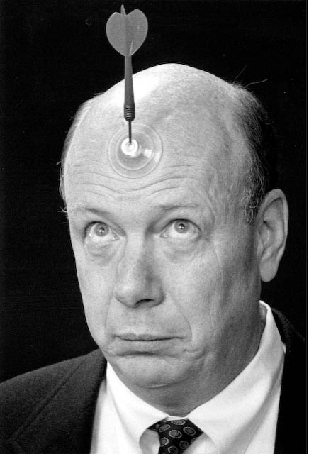
“Make certain your image creates a strong, positive first impression on your behalf!”
There’s more than a cliche in that statement. The common phrase “headshot” or “head shot” is your online introduction to new contacts in business. Consider it to be what it is – a business portrait to ensure a good first impression.
Jon Rowley with Alan Key quote
Creating the proper business portrait is about a lot more than the equipment used. It’s about the skill of the photographer to present YOU to those who’ll see you in a manner that they’ll remember positively. We at Jeff Behm Photography are experienced in how to help you make that positive impact.
Call today to make that strong, positive statement! 724-730-8513 or email jeff@jeffbehm.com
Every once in a while I walk the beautiful downtown of Frederick, Maryland – the city I call home – to create photography that is more personal, purely for enjoyment. Frederick is built for walking (must be due to it’s 277 year existence). The very first time I visited here, I was reminded of older European cities like Edinburgh, Lyon and Brussels. Montreal and Halifax in Canada also came to mind. All are walking cities I have enjoyed. When there, just as here, quality photography is the goal!
Second Street: Three Flags, Three Homes
Anyway, out I went in the middle of a hot, sunny Monday in August. Photography with the sun high in the sky is not ideal for a number of reasons, but it was the time I had, so I’d deal with it.
My professional work is almost exclusively products – things like electronics, machinery, jewelry and food plus corporate headshots and executive portraits. This kind of ‘seeing’ is a refreshing artistic change. No matter what the subject or motivation, quality is the goal!
On Second, looking east
I found what I wanted on Second Street, in the vicinity of St John’s Church, near the intersection of Second and Maxwell. Very glad I live here now, much as I miss western Pennsylvania.
Black & white is the bomb!
Jeff Behm Photography, with over 30 years of professional expertise, is headquartered in Frederick, MD, but travels wherever clients may need us.
Call 724-730-8513 or email jeff@jeffbehm.com NOW to learn how we can be of service to you.
Utilize dramatic color in a commercial #photography assignment to draw attention! These hooks themselves are glued to a large sheet of optical quality glass. The glass has then been thoroughly cleaned and mounted vertically between two light stands, 4 feet off the ground. Five feet behind this assembly is a background of black seamless paper. A blue Rosco gel in front of a powerful strobe with a grid spot has been aimed at exactly the right position on the background to emphasize the hooks and their features. By using black seamless, more power is needed to create the proper blue, but it also produces a rich saturation with nice fall-off to the dark edges.
Next we lighted the hooks themselves so that they’re not just silhouettes against the blue. They need to show texture and detail. This requires careful placement of the lights to avoid reflections in the glass. Since angle of incidence equals angle of reflectance, it’s realistic to expect that “what you see is what you get” is in play here. Some test shots were required to confirm that all was as expected, to refine the blue spot placement and the drape of the cords. As is common in #advertising and #commercial photography, the conceptualizing, construction and checking took the most time, but the results were worth it. The image was designed to sell thousands of these adjustable tie-downs. It was well worth the investment by the client.
Psychology of color
An interesting lesson learned early. Red attracts attention the most quickly, but then repels it most quickly. What a surprise that was! Blue attracts attention second, and very nearly as quickly, but retains attention longer than any other. Blue also suggests peace, water, tranquility, and reliability. Care to guess why we used blue in the ad above?
Green suggests health, tranquility, power and nature. The color is a reason this china is appealing, and why we used a rich green shining through the glass beads in the background.
Jeff Behm Photography is a professional photography service providing advertising imagery across two continents. Call 724-730-8513 to discuss your needs, visit www.jeffbehm.com or email jeff@jeffbehm.com
To see posts on #jewelry, #food, #product or #headshot photography visit https://www.behmphoto.com/sometimes-you-just-need-a-great-steak/ or https://www.behmphoto.com/jewelry-in-focus-front-to-back/ or https://www.behmphoto.com/headshots-on-location/
This may not look like much to you now, but to this commercial photographer, it’s essential. If this kind of intense color or mixture of colors was important to your image, these color swatches provide you a hint of the degree to which we can control them. The top row runs from pastels that are still intensely colorful, to deep, saturated colors. It makes no difference what colored gels we choose, this degree of control is part of what we can provide for you.
Those middle and bottom rows demonstrate our control of the focus of the background from highly blurred to nearly focused, whether at an angle, like the middle, straight or something else entirely.
This is NO ACCIDENT!
Want near nuclear neon color? We can do that. Want something a little more subdued? We can do that, too. Want a mix of your corporate colors? Sure thing. Want a clean look or a little down and dirty or scruffy? Yeah. That too. Want to learn more? Visit https://www.behmphoto.com/what-do-you-sell-yeah-we-photograph-that/
The purpose is control. Making my living as an adverstising and commercial photographer demands rigorous control of the technical, as well as artistic flare. Look for more along these lines in upcoming posts.
Why all this talk about controlling the light in the background? Because in addition to your product, the setting is part of the appeal of an add. It may not be as obvious as what we’re showing here, but whether bold or subtle, hues and tones make your product stand out. Consult with us, we want you to be successful. #commercialphotography#advertising#food#jewelry
.jpg)
.jpg)
.jpg)
.jpg)
.jpg)
.jpg)
.jpg)
.jpg)
.jpg)
.jpeg)
.jpg)
.jpg)
.jpg)
.jpg)
.jpg)
.jpg)
.jpg)
.jpg)
